
| BCGControlBar for .NET > Grid Control > Grid Architecture |
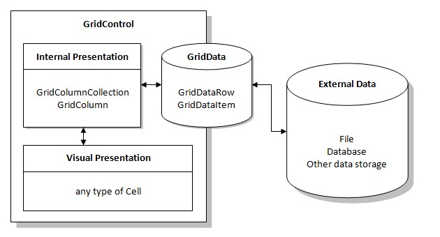
Grid control implementation separates data and it visual representation / editing. The following diagram outlines the top level architecture.

You can see that external data is loaded into a GridData object. This is a separate component that can be plugged in to one or more GridControl controls. (To plug in the data just set GridControl.GridControlData property).
GridData maintains a collection of GridDataRow objects, where each GridDataRow object represents a GridControl row.
GridDataRow maintains a collection of GridDataItem objects, where each GridDataItem object encapsulates the real data loaded from external data source. Access to this data is performed through GridDataItem.ItemData property.
GridControl displays the data using Cell-derived objects. Cell (and derived types) is a visual representation of data, as well as a tool intended for editing of the data it displays. GridControl maintains a view to the visible part of GridData (the size of the visible part depends on row/column size, grid control size and scroll position) and builds a list of cells to display the data.
A life time of individual cell is short - when layout of grid changes (e.g. the visible part of data has changed) the GridControl rebuilds the list of cells. Therefore you should never store references to cells or make any assumptions about their existence.
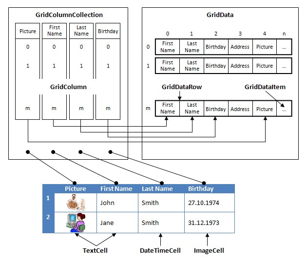
GridControl maintains a collection of columns, where each column is represented by the GridColumn class. The order of columns in collection is not strict and it reflects current order of columns on the screen as user drags and drops them (if current settings of grid control permit drag and drop). The relationship between columns and data they display is defined by the GridColumn.DataIndex property, which must be set manually for non-databound grids. In this way you define the Grid's scheme. The picture below outlines the relationship between columns and data:

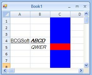
The last important class in the grid architecture is GridCellVisualStyle. This class defines appearance of individual items, columns and rows - all of them holds references to an instance of GridCellVisualStyle. When the Grid control builds a list of cells to display currently visible data, it loops over all data items in the visible range and for each item builds a GridCellVisualStyle object, which is assembled (merged) from visual styles (if any) assigned to corresponding item, row and column. The resulting visual style is assigned to a Cell that represents its data item on the screen. For example, if some data item is assigned a Bold font, the column where it resides is assigned a style with Italic font and the row where it resides is assigned Underlined font, the resulting text will be displayed as TEXT. However, if data item is assigned a visual style with red background and its column has blue background, the background of cell displaying this data item will be red.
